SQ Website

TFD Logo

More than just a website


First class features. Considerate and connected design.

A robust system, able to handle the needs of 330+ destinations of retail, food, and lifestyle, at an evolving centre that is at once a neighbourhood hub and an international destination. 

Information is only entered once and automatically surfaces in all relevant areas of the website, in various formats, and shown/hidden on a schedule when necessary.


Customer experience is prioritized, showing the most commonly desired information first; then offering deeper, yet relevant information to help the customer on their journey.

Whether informational or editorial, content is relevant and engaging, making connections to additional content for customers to discover information, products, and destinations of interest.

Serves the needs of multiple departments and types of destinations (stores, restaurants, entertainment/lifestyle, services) within the centre.

Integration with multiple systems, with data taking on the brand’s visual identity whenever possible.

A living example of the brand. The website’s aesthetic complemented all marketing materials. Layouts dynamically adjusted based on the availability of content, maintaining cohesion. Every decision exemplified the brand philosophy of exceptional service.

Contributions

  • Leadership:

    Selected by Marketing Director to be project lead and manager


    Art direction


    Managed migration from previous platform and the transition from the former to new web development team


    Empowered team members with personal instruction and tools to uphold brand standards


    Website CMS training


    Budget management


    Tenant onboarding and content standards coaching


    Collaboration with web development team


  • Creative:

    Maintained first-class desktop and mobile experiences, while the trend was to prioritize mobile at the expense of desktop (UI/UX)


    Visual identity design and brand management

    Website and user interface design


    Photography (interior/exterior/lifestyle)


    Website served as a major contributing factor to the Experiential Design of the centre and customer journey/relationship

  • Technical & Logistical:

    Liaison between web developers and marketing team


    Conceived, clarified, and realized objectives and features, based on extensive knowledge of objectives, technical possibilities, and customer experience


    Wrote and designed tenant portal manual and content guidelines


    Devised features to streamline processes for multiple departments and customers alike

    Managed relationships between multiple departments and their tools to implement a unified location for functionality


    Fostered a marked improvement in SEO


    Ensured extensive use of SVG (scaleable vector graphics) and Retina resolution (2×)  photos, for beautifully smooth and crisp images on modern displays, at a time when most websites did not implement these features.

An eventful place

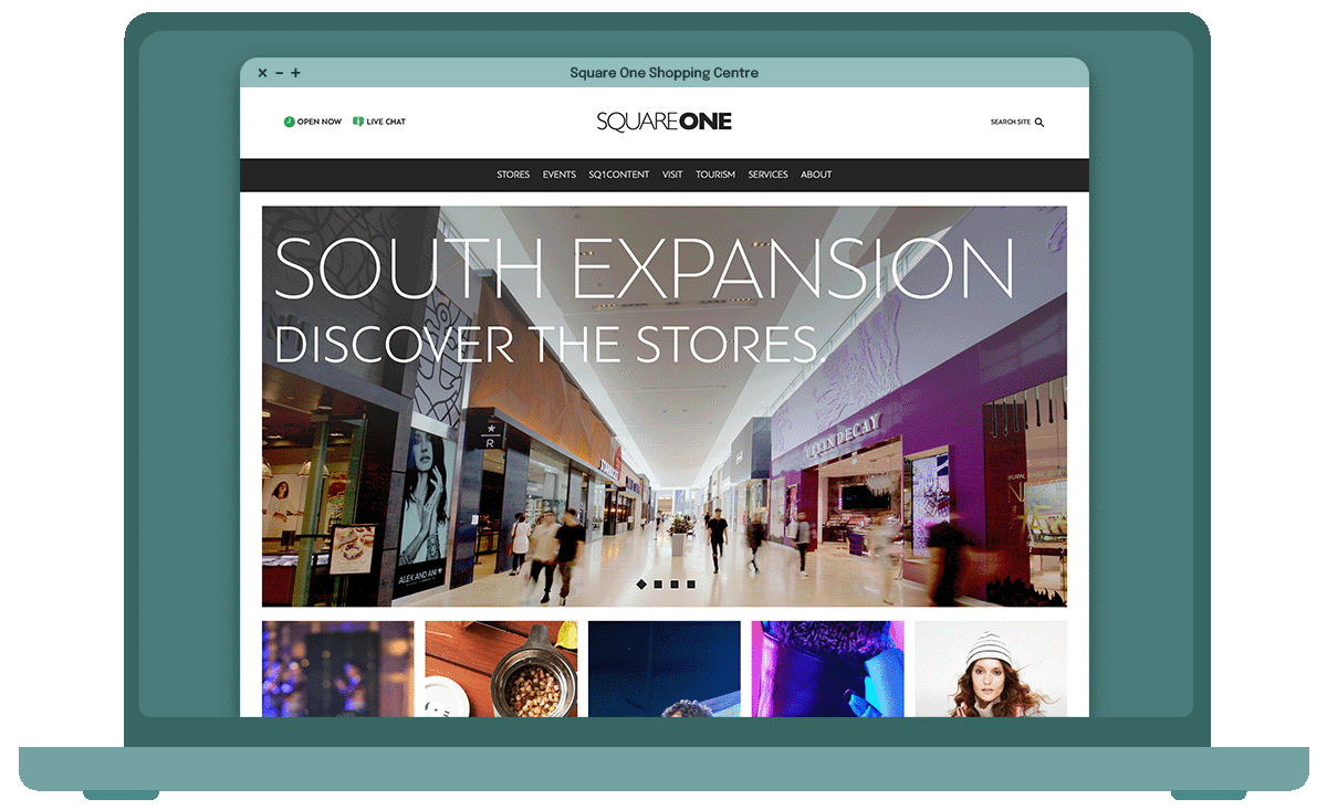
With a strong identity of its own and an increasingly distinctive vibe, the centre required its website to instantly provide visitors with a sense of eventfulness and ability to engage with it on a meaningful level.


Not to be thought of as simply another building with stores, the homepage established the centre as vibrant and offering worthy experiences, including elevated services (online and in person), events, and desirable brands.


The homepage also includes a feed of the latest articles from the centre’s own digital publication, discussing topics that tie into the centre’s offerings, including interviews with industry experts, both written and in the form of a first-of-its-kind podcast.

The best Hours page in the world

Operating hours are one of the most commonly sought-after sets of information about a business, and when it comes to a complex with hundreds of destinations, you need to know—and manage—a lot more than just “when are they open?”


Automations that help customers plan

The list of holidays is dynamically sorted to show upcoming dates first. Once a holiday is over, it moves to the bottom of the list, showing its date and hours for the following year.


Changes to hours over a range of time (i.e. extended holiday hours), are scheduled via the website's admin tools and automatically populate where relevant (see Integration).

Not all operating hours are equal

Hours of destinations that differ from the main centre are beneath the main list in expandable sections, complete links to their respective directory pages. Each directory page also shows its destination's unique hours.

Accurate hours, when and how they’re needed

Hours and dates are entered once through the admin area of the website and surface wherever needed with correct formatting.


Hours automatically control the status of the “open/closed” status in the header, the "Today's Hours" section of the hours page, and hours summary in the footer of the website.

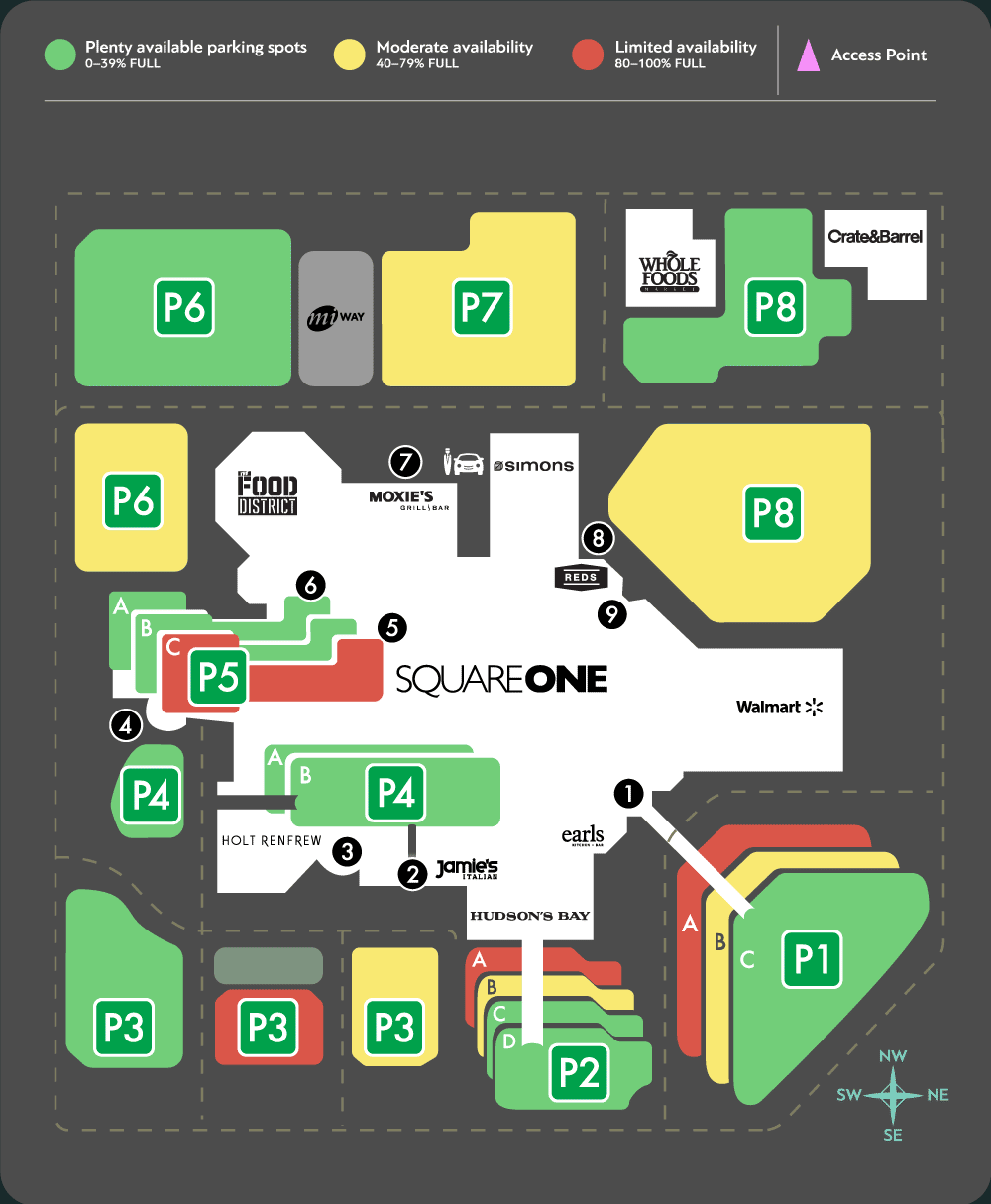
Parking: That’s the spot.

The award-winning parking map significantly improves one of the most common pain points of a large, popular centre: quickly finding a spot. It clearly indicates all major parking lots, colour-coded to give customers an idea of how quickly they’ll be able to park.


To assist with navigation, all entry points from surrounding streets are indicated. Selecting a parking lot, entrance, or key destination provides directions to that specific location in the default maps app on the user’s device.


The Parking Map graphic is “smart” and updates by communicating with a parking sensor system to the determine occupancy status of a parking lot.


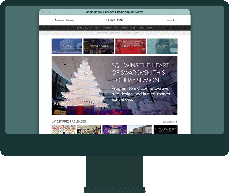
Plenty of room for media

While most of the website is tailored to customers, the Media Room caters to Public Relations and Media personnel. Modelled after the website’s lifestyle editorial, the Media Room provides a user-friendly, on-brand experience that makes accessing information relevant to media a breeze. We consulted with top-rated Public Relations professionals and audited the PR/media sections of popular websites to provide the best possible experience for this important audience.
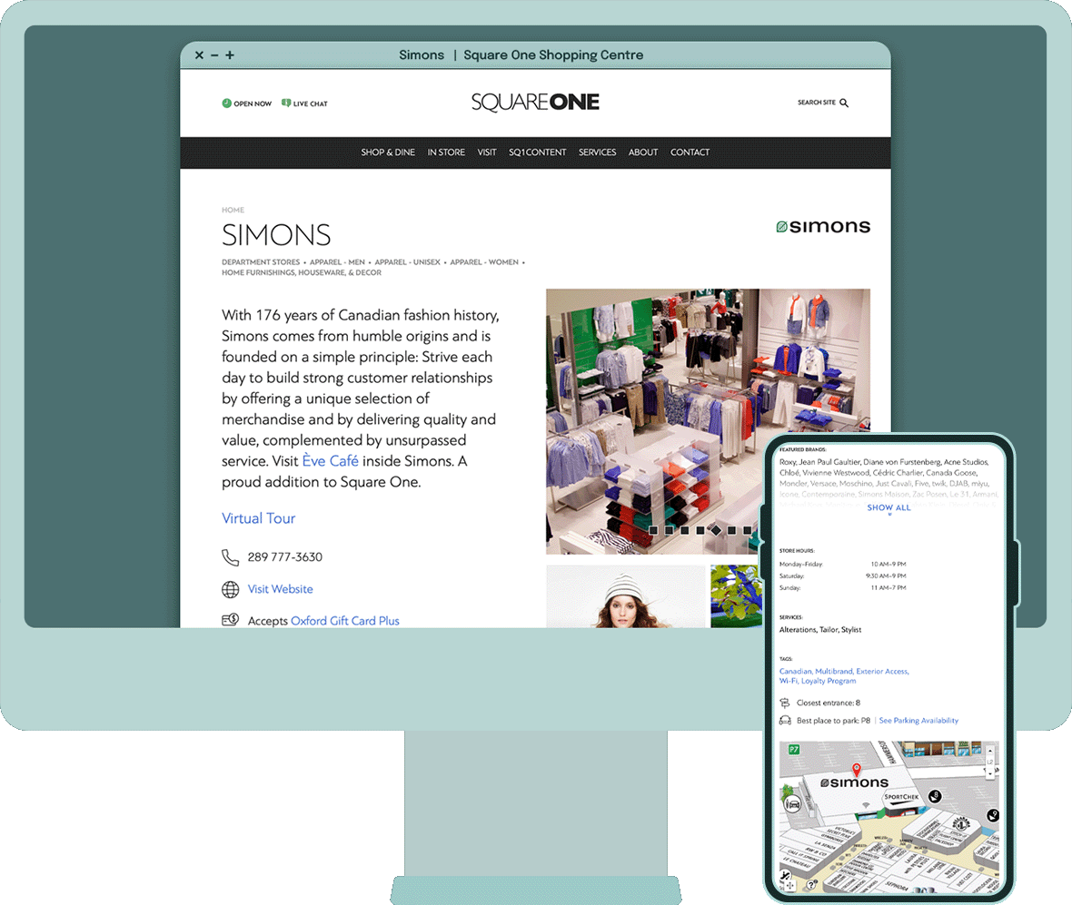

Door Decal

A lot more in store

Like a team of seasoned butlers, each of the 330+ directory pages is designed to consider what a customer might be looking for, and looking sharp while doing it.


Every page element helps with understanding if the destination is the right fit for the customer’s needs, and how to contact, navigate to, and identify the destination.


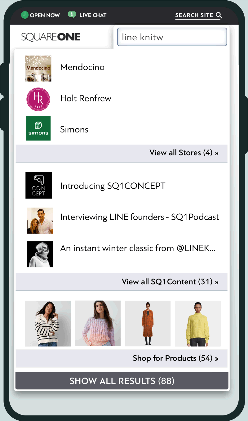
Search that satisfies

Search should be simple, accurate, and responsive. The initial search experience rapidly displays the top results in all relevant categories, updating as you type, complete with names and logos/thumbnails.


When you view all results in any category, you are taken to a list of search results, presented in a familiar search-engine style. Results are sorted by category or reverse-chronologically.


The feature integrated with the store directory, website content (including blog-like articles, podcast episodes, static pages, promotions, and events), and an online shopping platform that displayed products from multiple stores, without having to leave the centre’s website.


Door Decal

Formidable productivity boosts

Even something as mundane as a form can set the tone for the level of service that was offered by the centre and that a brand stands for.


Friendly, informative pages included time-saving forms for customers, tenants, and tour operators. This streamlined daily operations for multiple departments, and resulted in faster response times for customers.
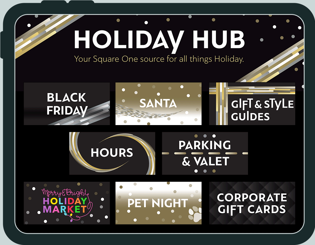
Hubba Hubba

Hub pages take advantage of the automation features of the website. These pages, which are themed around a specific holiday or event, display their own content and connect to relevant content and features from other areas of the website, with seamless integration into the page’s layout.


Hubs are designed to help customers plan their visits to the centre, informing them of relevant services, events, activities, promotions, and programs in one convenient place.


Additional Features

  • Tenant Management Portal

    The tenant content management portal offered staff of destinations (stores, restaurants, etc) to submit updates for approval, including hours, service advisories, promotions, destination descriptions, and job postings, all of which had scheduled publish/removal dates.


    It was custom-designed to fit the needs of both the centre, its team members, and the 330+ tenants, making it easy to have submissions that were complete and maintained a consistent appearance. When it wasn't possible to automate great looking content, tenants were trained in content guidelines, with a digital copy of the manual was available within the portal, and a printed copy at their physical location.


    Enforcing these standards helped to elevate their brand and maintain the quality experience on the customer-facing website.

  • Search Integrations

    Besides name and content, your search is assisted by page-specific tags, both visible and invisible. The visible tags could be the things a person might associate the store with, such as “travel,” “men’s clothing,” or a list of brands. They could also be more niche such as “Canadian,” “alterations/tailoring,” or “accepts appointments/reservations.”


    Invisible tags are the behind-the-scenes helpers. For example, if a customer searches for a store that isn’t at the centre, like Sears, they will see suggestions to check out Hudson’s Bay or Simons, which likely provide the products or services they’re looking for. If a customer searches using a common misnomer like “Sports Check,” they will be shown Sport Chek. Thoughtful accommodations like these ease a person’s search and increase the likelihood of keeping them as a customer.


    Search also integrates with an e-commerce system, in which participating retailers could have their products surface within the website, integrated into its design and layout for a seamless experience. Products could be added to a multi-retailer cart and purchased together.

  • Service Advisories

    With the centre often being referred to as its own city, and with construction and expansions constantly happening in and around the property, a Service Advisory feature set was implemented.


    Service Advisory notifications would appear when, and where required, across the website. They took on the appearance of a highly-visible, yet non-distracting message bar, just below the website header.


    Examples of advisories:

    • Exterior construction, requiring alternate routing (Parking Map page, centre map page)
    • Store closing for inventory (store directory page)
    • Store relocation (directory page)
    • Temporary addition/modification to amenities
    • Business name change (directory page)
    • Re/Opening date (directory page)

    All advisories are also be compiled onto a dedicated Service Advisory page for viewing at a glance. On the administrative side, Service Advisories had scheduled posting and removal dates to keep the process convenient and streamlined.


    As part of the customer-service oriented principle, whenever anything (store, entrance, service) is posted as unavailable, customers are offered an alternative solution or estimated time for when that amenity would become available once again.

  • Search Engine Optimization

    • Taxonomy (data classification and structure) was set up to be SEO friendly from inception
    • Directory pages with full descriptions, list of services, brands, and relevant keywords
    • All pages could have searchable keywords added
    • Designed with compliance of the latest versions of AODA (Accessbility for Ontarians with Disabilities) and WCAG (Web Content Accessibility Guidelines)
    • Constant updates via Tenant portal
    • Regular updates to blog-style articles
    • Regular informational (standard) page updates, including around special dates/holidays
    • Back-end (inner workings) of website were regularly optimized with the latest standards in accessibility, mobile responsiveness, page load times, and SEO practices

    This website yeided a vast improvement in SEO over the previous website for the centre. A simple Google search for the brand name used to return mixed results, mostly unrelated to the centre. The results were noticably in the brand's favour after the launch of this website.

Results

This website was more than just a set of informational pages; it was a truly interactive, responsive, and “smart” web application, which automated many tasks and facilitated the needs of multiple departments and customers alike.


It provided a consistent digital destination for many successful campaigns, integrating with social media and other systems, both internal and external. It vividly represented the brand with its design integrity, cosmopolitan appeal, and a deeply ingrained service-oriented approach.


With its multifunctional nature, and accessibility considerations from the ground up, it played the starring role in the centre's SEO and overall online presence.


Analytics

  • Visitors increased from 2.1 to 2.2 million in the first year (2016)
  • Referral traffic increased by 45.5% in 2017, followed by 153.5% in 2018
  • Direct visits increased by 7.5% (2018)
  • New users increased by 64% (2018)
  • By the website’s final year under my direction (2019), it achieved a 44.3% increase in unique visits, a 55.1% increase in total visits, a 169.6% increase in page views, and a -24.5% reduction in bounce rate compared to the previous year.

Tap image to view more

Share by: